Carefree, curious, creative — these are all words that have been used to describe Pantone’s 2022 Color of the Year, Very Peri (PANTONE 17-3938). This new and fresh periwinkle-like purple is a member of the blue family, but its violet red undertone makes it playful and interesting.
Here’s how Pantone describes the color: “With trends in gaming, the expanding popularity of the metaverse, and rising artistic community in the digital space, PANTONE 17-3938 Very Peri illustrates the fusion of modern life and how color trends in the digital world are being manifested in the physical world and vice versa.”
So if Very Peri excites you, how exactly do you use it in home design? We have a few suggestions:
Go Small

Very Peri is an intensely saturated, bright, and unique color, so starting with small applications is a great way to introduce it into your home. You can:
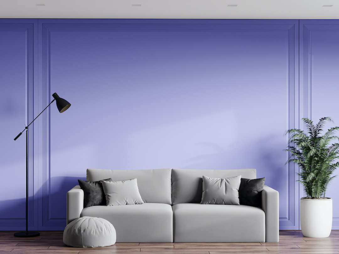
Use it as a wall accent color in a bedroom or office. You’ll be inspired from the moment you wake up or sit down to work.
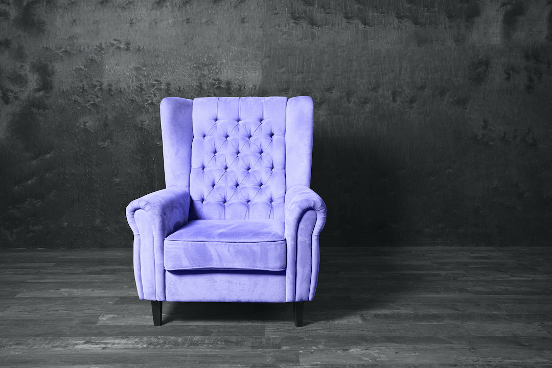
Bring in peeks of the color in decor like a patterned rug, pillows, an upholstered chair, or artwork.
Combine it with natural colors and elements — like natural material rugs or light wood accents — to play off its calming qualities.
Go Big


Very Peri is not a color to be ignored! Play up its statement-making qualities and make it front and center. You can:
Use a lighter version on full walls of a room, such as a dining room or study, to feel a fresh feeling.
Opt for the fully-saturated color on the walls of smaller spaces, such as a bathroom, study, or den.
Bring it outside and paint your front door or shutters this imaginative color to add a bit of whimsy.
Look for large-scale artwork with this as a prominent color to display on a neutral wall.
However you choose to use Very Peri, it’s sure to inspire joy, creativity, and imagination! For more design ideas, browse our online Photo Gallery.


